
The Place Intelligence Platform simplifies location data exploration with interactive maps, filters, and analytics. Designed for advertisers and analysts, it delivers actionable insights effortlessly through intuitive visualizations.
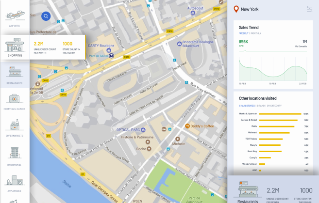
A location intelligence tool for advertising and analytics, featuring interactive maps, filters, heatmaps, and data insights. Showcasing InMobi’s capabilities, it supports global decision-making with experimental wireframes for user-driven control over data.
The challenge is making sure the platform feels natural. Whether someone is looking at heatmaps, trends over time, or specific locations, the experience should flow smoothly helping them uncover insights without second-guessing their next step. Every interaction should feel like a conversation, not a chore.
It’s also about telling a story with data. Instead of just throwing numbers and maps at the user, the platform should guide them, highlighting patterns, making comparisons easy, and surfacing key takeaways in a way that feels effortless.
At its core, the challenge is making powerful analytics feel human, helping users get answers quickly, clearly, and without frustration so they can make confident decisions.
Thought Process
Before diving into UX design, it’s essential to step into the user’s shoes and understand their goals, challenges, and expectations. Here’s how I approach it:
Define the Core Problem
Understand the Users
Map the User Journey
Prioritize Simplicity & Clarity
Define Key Interactions
Validate with Rapid Prototypes
This thought process ensures that every design decision is rooted in real user needs, leading to a product that is not just functional, but also intuitive, engaging, and valuable.
The UX solution focuses on making complex location data easy to explore and act on through an intuitive, interactive, and visually engaging interface. A map-centric design with dynamic filters, heatmaps, and smart recommendations allows users to uncover insights effortlessly. Personalized dashboards, guided onboarding, and contextual insights ensure a smooth experience tailored to different user roles. Graphical summaries, collapsible insights panels, and one-click deep dives help users quickly interpret data without feeling overwhelmed. The platform is designed for speed, clarity, and usability, with fast-loading maps, mobile-friendly access, and a dark mode option, ensuring a seamless and efficient user experience.
The UX outcome makes exploring location data feel effortless and insightful. Instead of struggling with complex filters or overwhelming dashboards, users can smoothly navigate interactive maps, heatmaps, and analytics to uncover trends in just a few clicks. Decision-making becomes faster and more intuitive, with smart recommendations and personalized dashboards guiding users to what matters most. The experience is designed to feel natural, reducing frustration, boosting efficiency, and making data exploration useful. Whether on desktop or mobile, the platform ensures smooth interactions, helping users confidently turn raw data into clear, actionable insights.

“The interactive maps and filters help me drill down into specific locations without feeling overwhelmed, which is a huge plus. I love how the insights are visually presented graphs, heatmaps, and summaries make the data digestible at a glance. However, I’d appreciate even more customization options to tailor the experience to my specific needs. Overall, the usability is smooth, and the platform makes complex data feel more accessible and actionable.”
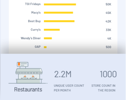
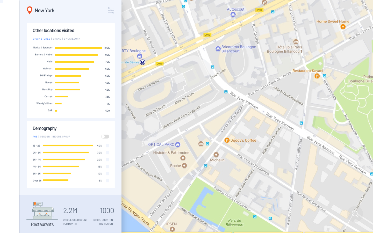
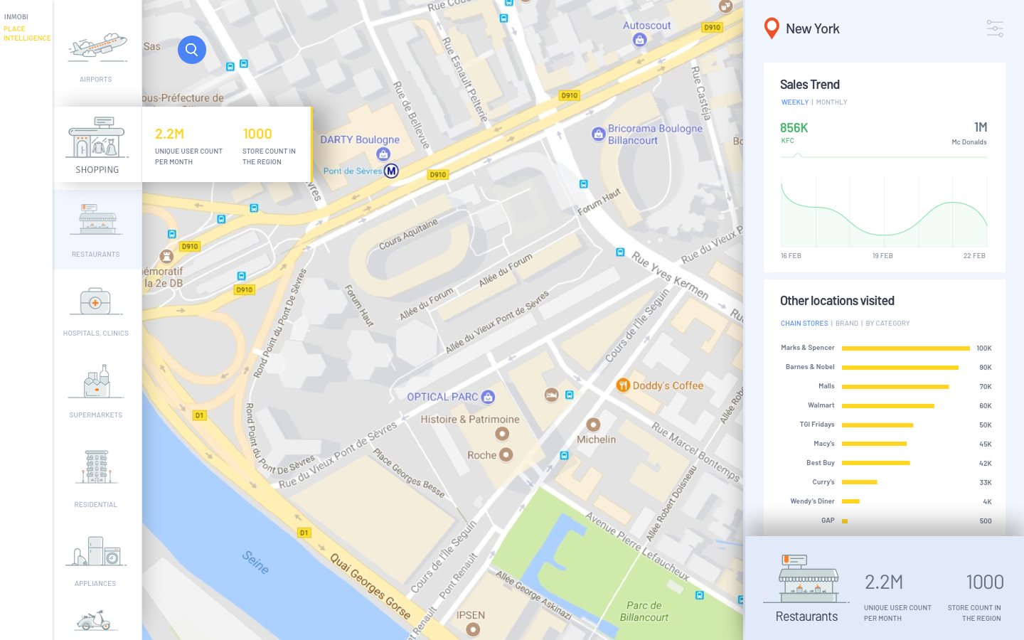
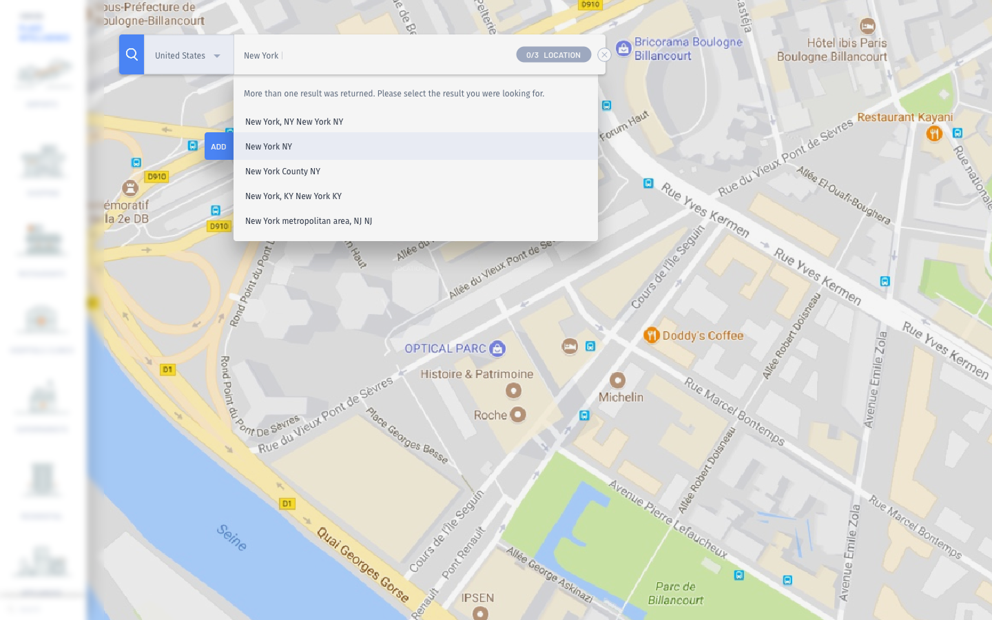
The design screens feature an interactive map with dynamic filters, heatmaps, and analytics for easy data exploration. Clear visuals and intuitive navigation help users quickly interpret trends and make informed decisions.
Copyrigt © 2025 MAUX - VIKRAM SUNDERRAJ